Infographic: UK Onshore wind farms in numbers
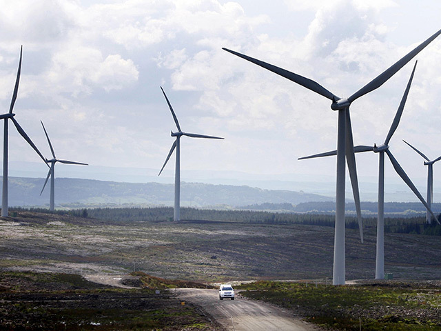
Here's a breakdown of UK onshore wind farms by numbers.
Here's a breakdown of UK onshore wind farms by numbers.
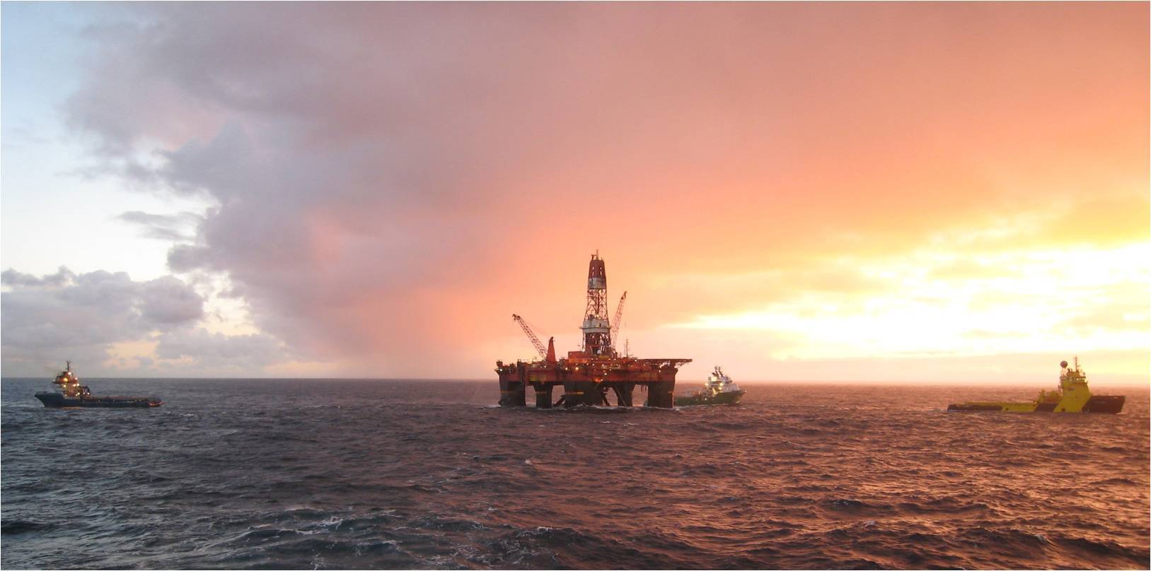
This infographic shows growth in production on the UKCS after the discovery of oil in the North Sea 50 years ago. Starting with BP’s West Sole platforms in the southern part of the North Sea in the late 1960s, oil rig sites continued to come online throughout the next two decades with other high profile sites such as Ardmore and the Forties oil field in 1975. As the map illustrates, production reached its peak in the late 1980s and early 1990s.
As the latest survey goes live on Energy Voice, we've collected the first findings from the project, which were revealed at OTC 2015. Energy Voice has called on the global energy sector to participate in the second part of its landmark research launched to mark 50 years of oil and gas exploration in the North Sea. The project is a response to falling oil prices, which placed the UK and wider global energy market under pressure.

This infographic shows the price of a tank of petrol versus the average salary worldwide. The data reveals both North America, the UK and Scandinavian countries fair the best when it comes to cost whereas regions including Afghanistan, Ethiopia and Egypt suffer from a small margin between income and petrol cost.
2015 has been a great year for techological innovation in the energy sector.